Welcome to the circle
Crafting extraordinary moments. A trusted group of visionary thinkers and creative experts. We possess insider knowledge of incredible talent, venues, and clients, offering a comprehensive 360-degree perspective on entertainment in all its forms
About us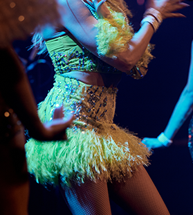

Our team is known for its ability to curate unique and memorable experiences. With our expertise, we seamlessly navigate the diverse landscape of entertainment, ensuring unparalleled creativity and satisfaction for our clients.
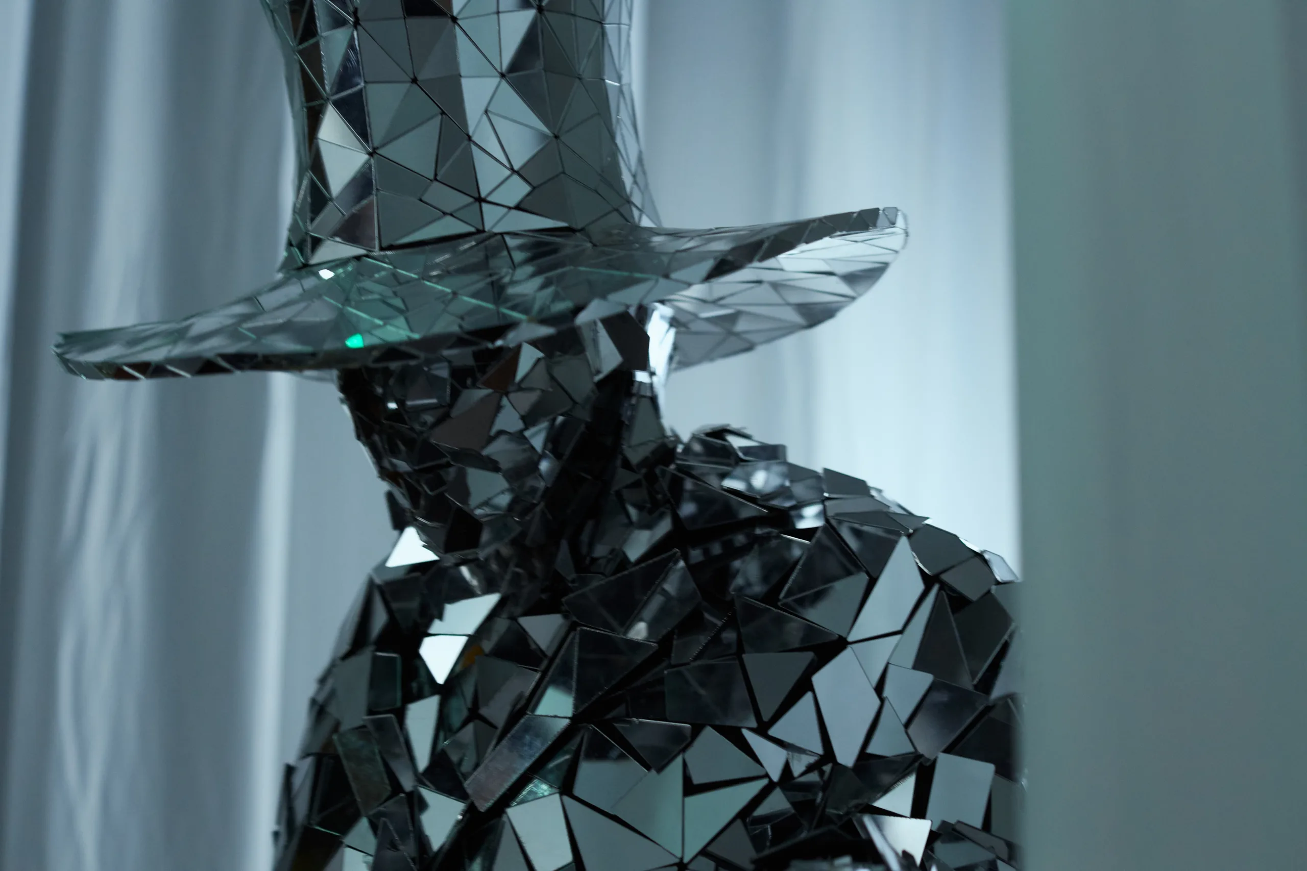
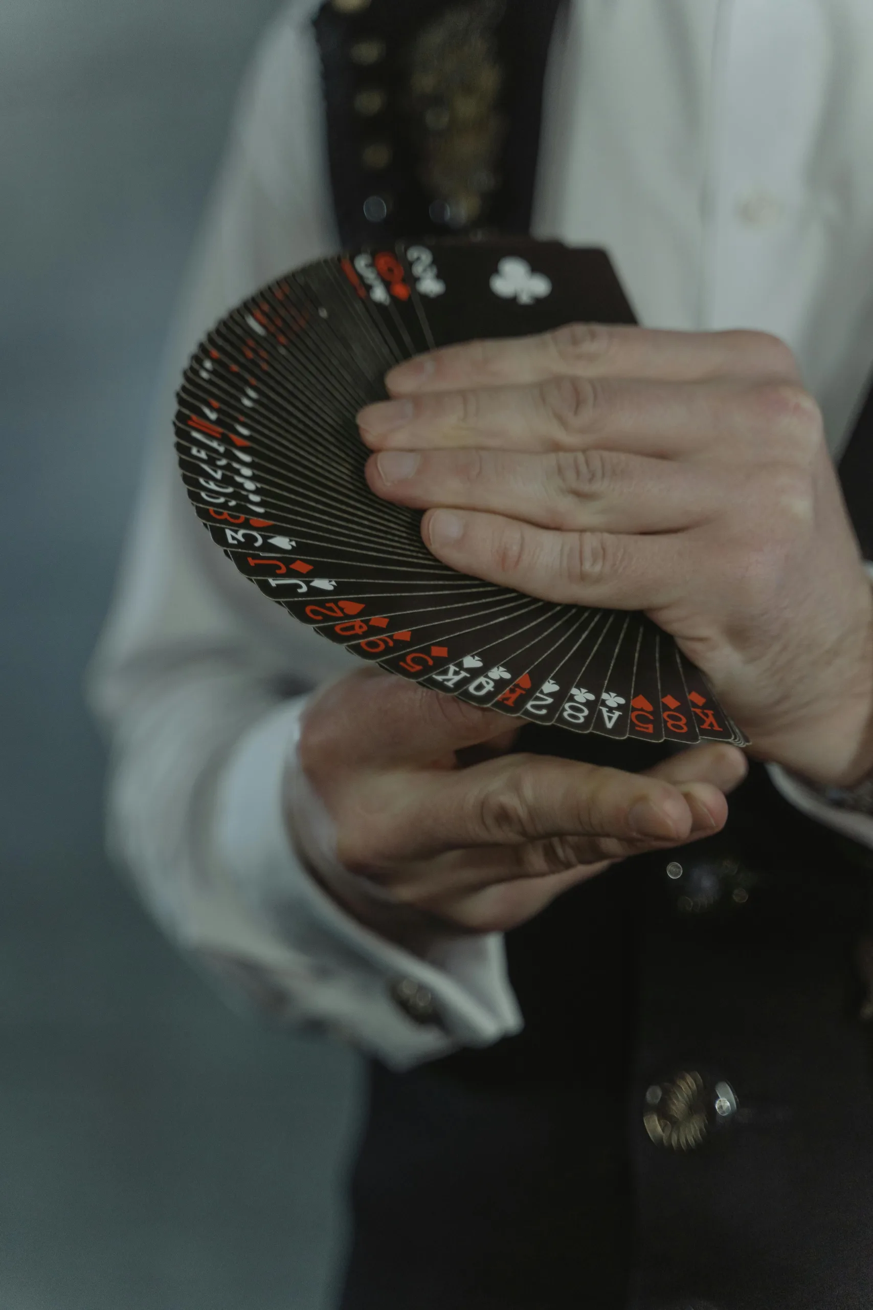
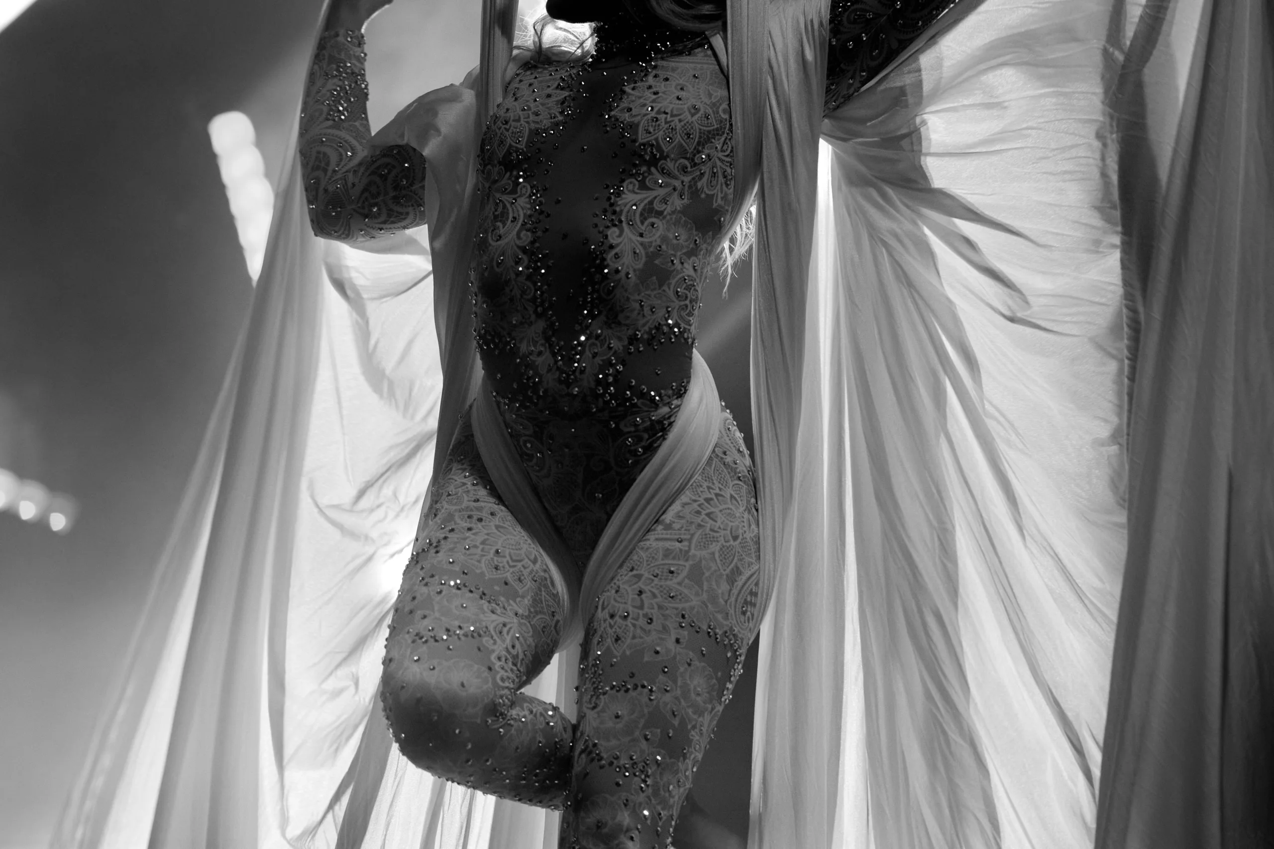
Our Acts


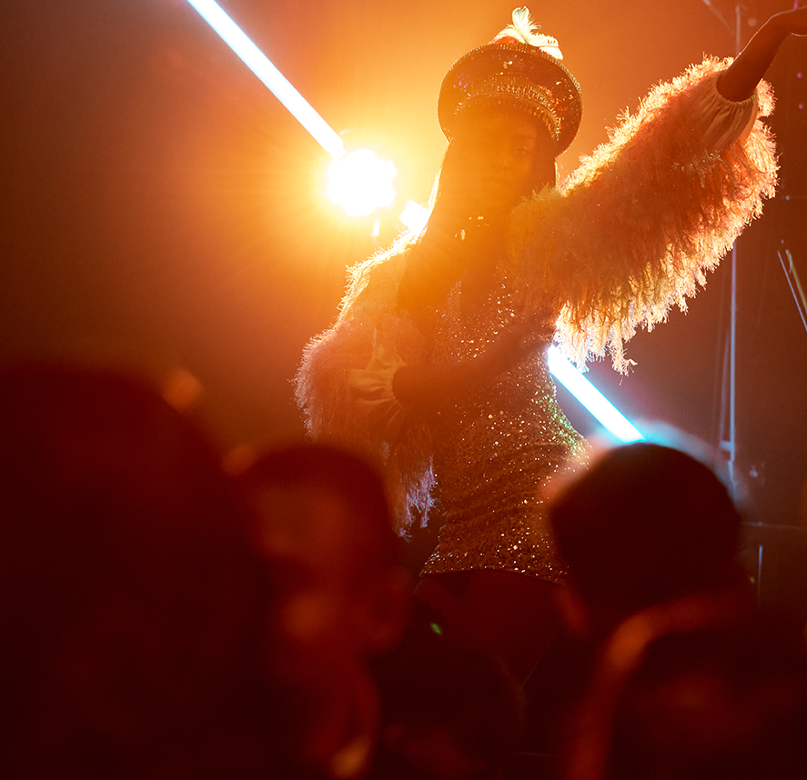
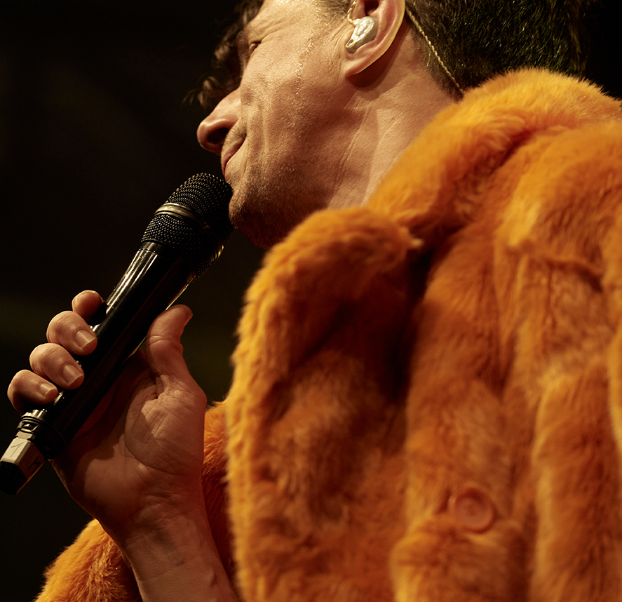
FullCircle excels in curating top-tier talent for events to ensure a memorable experience. They combine creativity with strategic planning to deliver bespoke shows aligned with clients' goals. FullCircle fosters clear communication between clients and performers, prioritising artists' needs for a smooth and enjoyable experience, while also meticulously handling technical and hospitality requirements, alleviating stress for clients and artists to focus on the event's entertainment value.
Enquire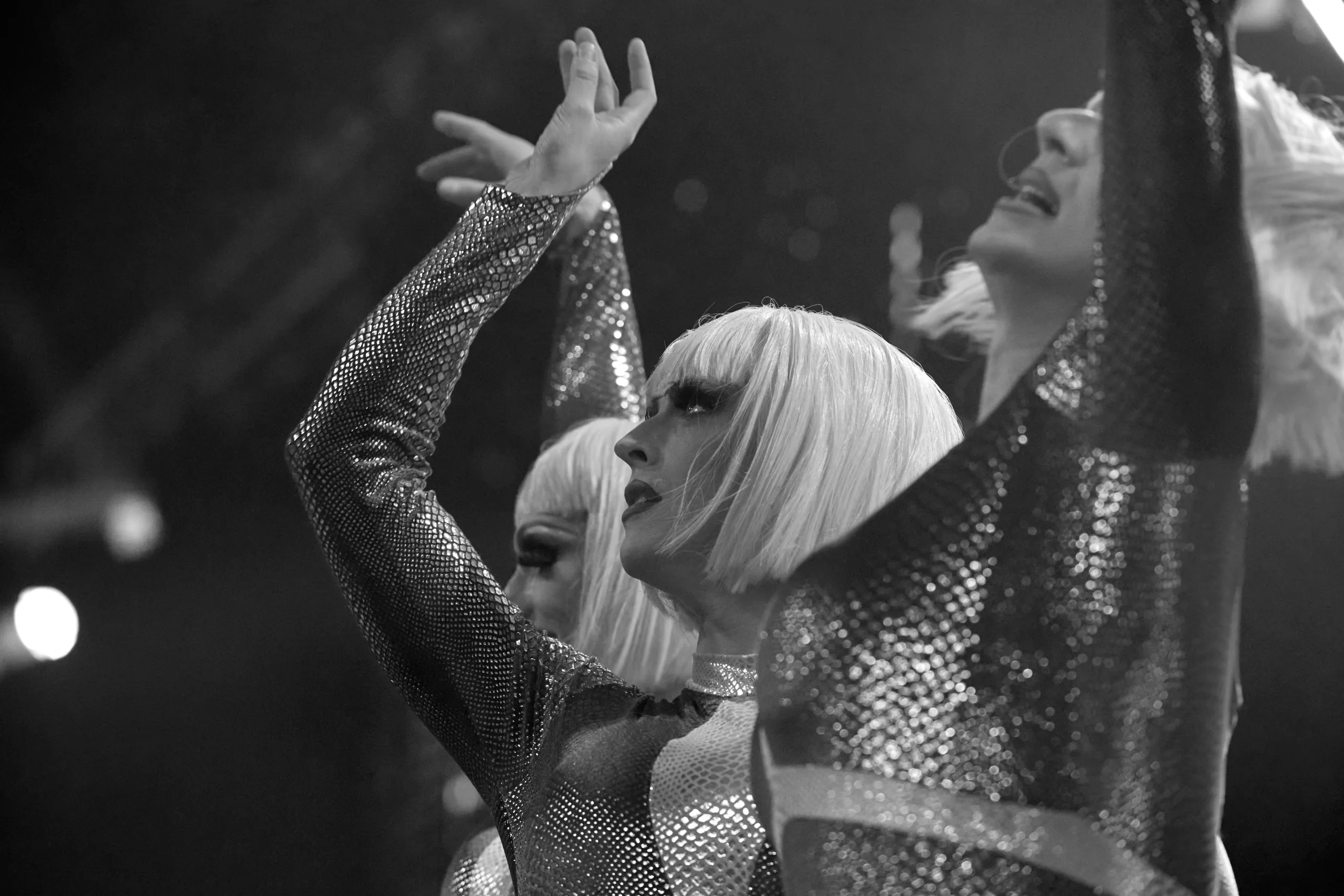
A full spectrum of extraordinary entertainment. One community.
